When you go to a new restaurant, how would you feel if you weren’t warmly greeted when you arrived? It might not be a very big deal for you and you would continue eating your meal, but it’s likely that the atmosphere of the place is less welcoming to you and chances are high that next time you would think of going somewhere more welcoming.
First impressions are extremely important and can make or break opportunities. The first email that you will send to your users after you get their emails is your website’s or brand’s first impression category, as is your homepage or landing pages. In this article, we’ll show you how to prepare attractive welcome emails and some examples of welcome email templates to give you some inspiration.
What is a welcome email?
A welcome email is an email that you send to a new lead, customer or subscriber (for blog, newsletter, etc.) of your website. Welcome emails can be a part of the onboarding or nurturing process or both marketing plans for your website or brand. They play a major role in customer retention, since they also have the highest rate of open and click-through rates among email campaigns, so it’s worth spending time designing your welcome email and crucial to select the content and design carefully.
Types of Welcome emails
General
This is an email you send when a user signs up and/or creates an account on your website. The email serves to welcome them and, according to your email marketing strategy, you can use it to offer discounts, coupons and more to increase engagement and conversion.
Subscription
This is an email you send when a user subscribes to your blog, newsletter or, depending on the type of business you run, purchase a plan or course to welcome them or give them the information they need to use or continue on your website.
Why are welcome emails important?
With a 30.69% open rate worldwide, they stand in the top email marketing campaigns. This statistic alone shows how important Welcome emails are, but if you are not convinced yet, check out the statistics below based on some studies:
- 74% of people expect to receive a Welcome email immediately after they subscribe, but only 57% of brands send Welcome emails—so if you start sending them, you can easily get ahead of 43% of your competitors.
- Subscribers who receive a Welcome email show 33% more engagement with the brand.
- Welcome emails have a 14.4% click rate, while this figure is just 2.6% on average for other email campaigns.
These stats are enough to convince any marketer to start a welcome email campaign as soon as possible if they don’t have one already.
In the next section, you will find the information you need to create an effective welcome email.
How to prepare a decent welcome email
A powerful welcome email should follow certain criteria that you should notice when designing yours, but, like all email marketing campaigns, there is no single correct way.
Share useful information
The content of your email should be helpful for new users, so based on your business, try to find that info and add it to your email. This can obviously vary but there are some fundamentals you should follow, which include:
- Highlight the advantage of your service or product over others. The welcome email is a great place to talk about it since it’s almost the beginning of the customer journey. As they say, “first impressions are the most lasting.”
- Connect users to your forum or social media channels to deepen the relationship.
- Talk about your responsibility for your product or service by mentioning the guarantee or support, for example.
Personalize it
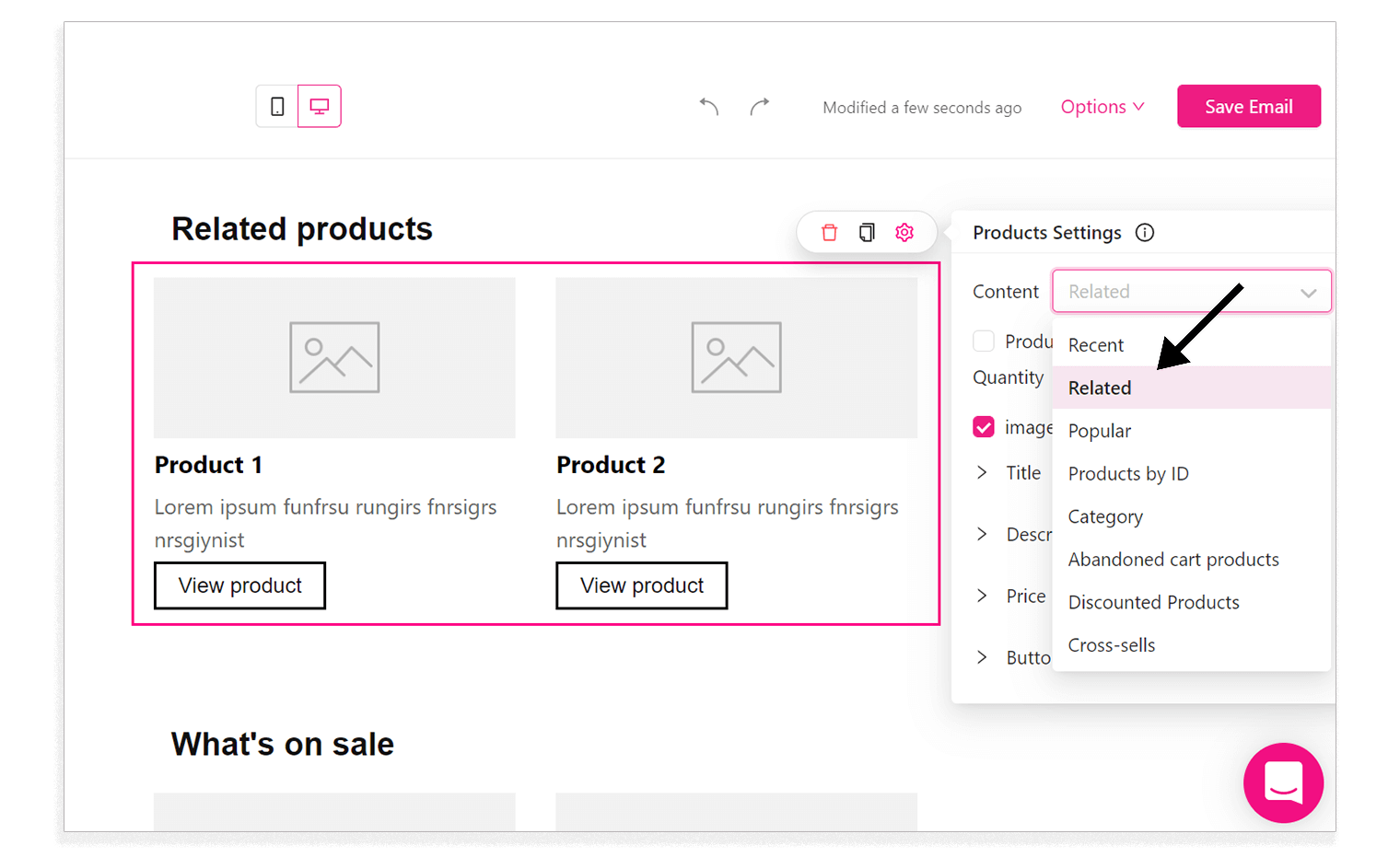
There is a direct relation between personalization and satisfaction that will increase the chance of better CTR and conversion. Why? Simply because with personalization users see more relevant content and will pay more attention, a behavior which studies support by showing an 139% increase in click-through rates for personalized emails. Growmatik will help you to create personalized emails using a drag & drop builder and some clicks.
Write a good subject line
The truth is, if you don’t have an enticing subject line, no matter how useful or well designed your email content is, it won’t get clicked and your marketing efforts just go to waste!
Here are some of the tips on how to write a good subject line:
- Keep it short
- Use a joke
- Write an intriguing sentence
- Personalize it (Growmatik allows you to personalize the subject line of your email as well)
- Avoid advertising language
- Use emojis
- Mention offers or discounts
- Use numbers
Here are some good examples of subject lines:
- Get a sneak-peek of our new course 🕵️♂️
- 🙅 10 UX portfolio mistakes to avoid
- One day left to get half off!
- You can still use Growmatik for free
- 60% off + free shipping
- Wondering if you have lost connection …
- Top picks just for [first name]
- Have you decided to use marketing automation yet?
Reinforce trust
Try to display items that can create positive effects on the user’s trust for your business such as social proof or contact information. If you have any certificates related to trust or security, this is a good place to show them off.

Remember it’s a part of nurturing
Your welcome email should work in harmony with your lead nurturing strategy, as it is almost at the beginning of the process. Stories that you represent in this email should be related to other nurturing materials. If you don’t have the same strategy for nurturing different categories of leads, it’s probably best to have various welcome emails according to each category.
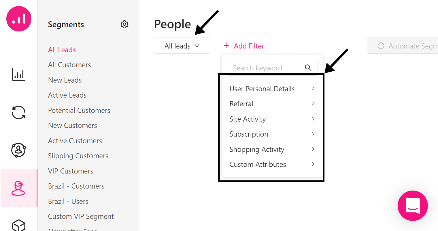
You can achieve this via segmentation. Growmatik lets you segment leads in various ways.
Design a clear Call To Action
What do you need your leads to do? In every email including welcome emails, the CTA is the action recipients need to perform, so it requires extra attention. To have a strong CTA you should:
- Use action verbs or words to describe what will happen after clicking.
- Highlight marketing value For example, if you offer a free version of your service you can add “Free” in the content of the button.
- Keep the text short and easily readable.
- Choose an attractive color and border for the button. It’s recommended you choose a color that is not used in any other part of the email so users can easily notice it.
To properly link the chain of nurturing to your welcome email, having a clear and attractive CTA is key.
10 welcome email template examples
Let’s check out some real-world examples of welcome emails together to get ideas and discover how companies are greeting their users. You can also design all of these email templates with Growmatik.
eBay
Subject: Welcome to the world of shopping [first name]! Find promotions, discounts, and free shipping on eBay
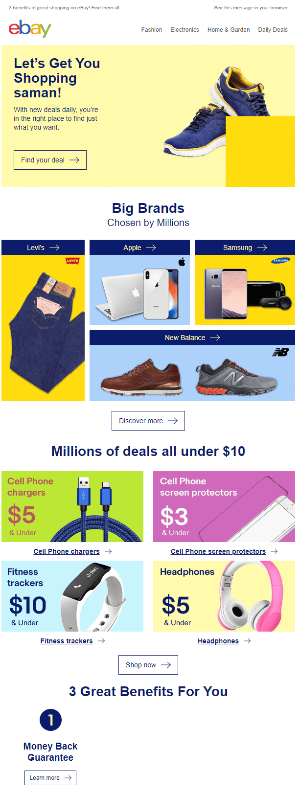
eBay’s welcome email includes their products and they have highlighted the benefits of their brand correctly. Although eBay is a famous brand, you can find money back guarantee (which will link to their guarantee landing page) at the bottom of their welcome email.
They personalized the email for me by calling my name, which helps me to feel this email is tailored for me.
The CTAs are not attractive in this email but every image has a link to eBay, which somehow compensates for the bad design of its CTAs.
I am not sure if they are using Growmatik or not, but with it they could offer personalized products to me when creating their email template.
Last pass
Subject: Welcome to LastPass!
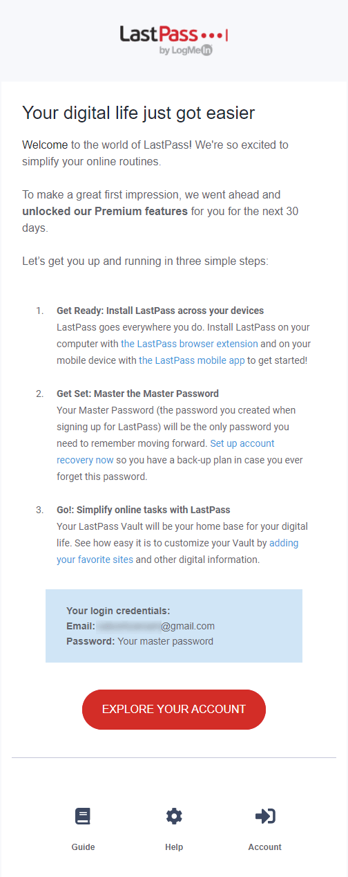
LastPass is a password manager browser extension that stores encrypted passwords online. They highlight the benefit of using their service with a marketing tone at the beginning of their welcome email. The CTA is beautifully designed and they add links to the guide and help page of their website to deepen the relationship with their users.
It would be better if they have personalized this email by addressing me by name, for example.
Data camp
Subject: Welcome to DataCamp!
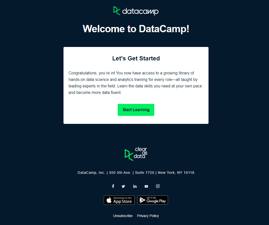
This is a good nurturing example for welcome emails, letting you easily target the Start Learning button and continue to their website (beginning your journey as a customer.)In addition to social links, you can find links to download their app if you open it on your smartphone, which is a plus. You also have the unsubscribe button to opt-out to avoid spam folders.
I cannot see any personalization in this welcome email, the addition of which would make this email perfect.
GitHub
Subject: Welcome to GitHub, [username]!

GitHub provides a lot of useful links for users in their welcome email to improve the stickiness of its application and nurture me correctly from the beginning.
They also prepared an opt-out option with the Email preferences button but there is no link to their social media and no clear CTA to their website.
Dropbox
Subject: [first name], your first Dropbox Paper doc is ready!
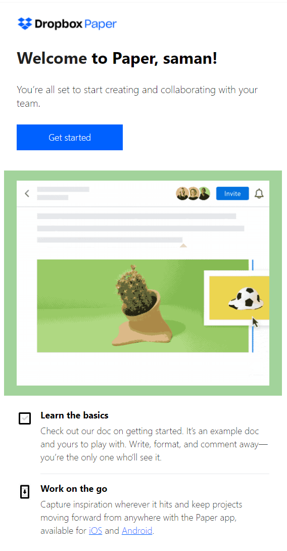
They personalized both the subject line and email body, which is a plus. The CTA is easily noticeable and useful links and download links are added in this welcome email correctly.
Coursera
Subject: Don’t lose momentum!
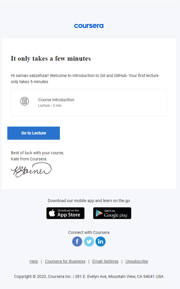
This is a subscription type of welcome email I received when I attended a course in Coursera and they welcomed me. It’s personalized and has useful information and links that I might need. The download links for mobile apps are also added alongside social media links to let me keep in touch with them.
Rigby
Subject: Welcome + Free Shipping
The Rigby marketing team knows how to nurture leads and they did it correctly in this welcome email. You can find links to different product categories and social media links with a free shipping offer at the beginning of the email.
But the CTA color is the same as the header and footer color, which is not recommended, and they could add some social proof from their satisfied customers to reinforce trust.
Twelve South
Subject: Thanks for signing up!
They did a good job letting users be confident when buying their product by mentioning warranty, return policy and free shipping (in the U.S) in their welcome email. CTA is designed well as it has a good contrast with the main color of the email and logo and social media links are also added to strengthen the relationship. The main thing missing in this email is personalization.
Lazy Oaf
Subject: Thanks For Signing Up! Here’s 10% Off Your First Order 🙃
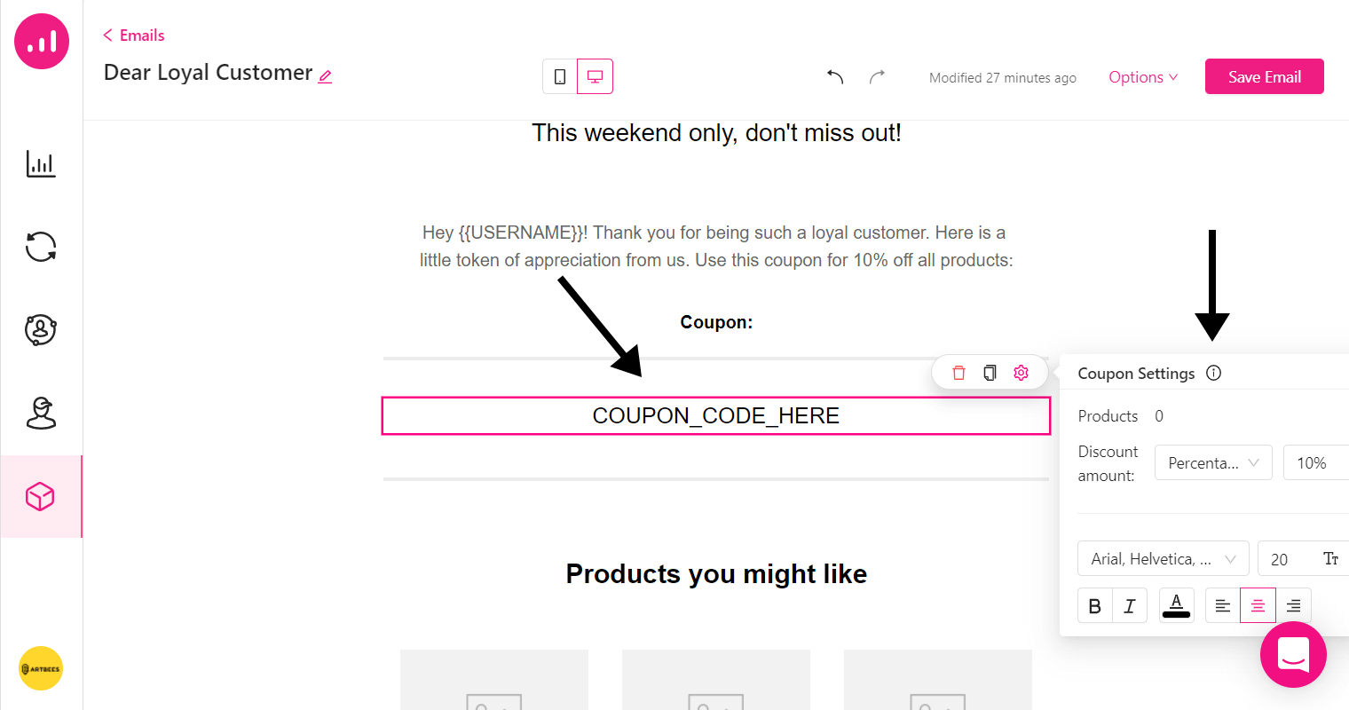
They did a good job nurturing leads by giving separate links to mens, womens and oafworld categories. Their social media and download app links were added properly to deepen the relationship. The CTA is distinguishable but the best idea to increase conversion in this welcome email was the coupon code, which they mentioned in the body as well as the subject line.
You can add coupons to your emails via Growmatik easily.
Under Armour
Subject: What makes us different?
You can realize from the subject line that they want to highlight their advantages over competitors. They managed this with attractive images in the email body. You can also find the social media links at the bottom of the email, but a good design is not everything.
There are some mistakes in this welcome email such as the lack of a CTA or personalization. They somehow failed in nurturing with welcome emails and users cannot go anywhere except social media accounts, which is not enough for a good welcome email.
Final words
We tried to explain the essential elements of a good welcome email template to you with some real world examples to show what to do and what not to do.
There is no single good way to create and design a decent welcome email, but just to recap, remember to:
- Add helpful links and information
- Encourage users to continue in their customer journey with offers or discounts
- Personalize your email or subject line
- Try to strengthen trust
- Attractive CTA is a must
Don’t forget how important this first step of your relationship with your leads is and don’t miss this opportunity to increase your conversion rate. Growmatik can help you do all of the above items easily, so let’s start creating awesome welcome emails!
