Ever find yourself scrolling through a page, wishing you could get somewhere a little quicker? Sure, headings help when it comes to finding something particular on a page. But sometimes, a shortcut would be nice to get straight to your destination.

That’s where a simple, tiny tool like an anchor link comes in handy. An anchor link lets a visitor jump between sections of a page. This subtle design technique boosts the overall user experience by guiding visitors along, ensuring they see the most important elements your page has to offer. Not only that, but anchor links can also help nudge your visitors along in the conversion process.
Anchor links can take different forms, but they commonly appear as hyperlinks or arrow buttons. Anchor links can be animated to capture attention. When you animate an anchor link, you can make the text flash a different color when you hover over it.
Wanna get your readers to sign up for your email list? Or save them from having to scroll all the way down to the last section of a page? If you’ve got a specific conversion goal in mind, you can use an anchor link to bring your visitor where you want them to go.
How to Use Anchor Links on Your Landing Page
CTA button
You want your call-to-action (CTA) button to be as visible as possible as the final step towards a conversion. Adding an anchor link to a CTA button shortens the customer’s conversion path.

This example from San Fran’s Rest uses a CTA “Build Yours” as an anchor link for visitors. The button brings them to the page section where they can begin to customize and place an order right away. Looks like this anchor link worked so well that they are all sold out!
Social proof
Social proof builds trust with visitors, so it’s no surprise that marketers of all stripes are eager to include it on their landing page. Customer testimonials show prospective customers that people have found value in your product. Social proof can motivate your audience to take the next step—but only if people read it. To highlight social proof on your page, use an anchor link so visitors are more likely to pay attention to this section.

Shoutout’s landing page includes an anchor link to bring visitors to their social proof section. Their “Wall of Love” showcases all the social posts from customers who dig their product.
Lead generation
Landing pages can be full of information, but it’s important to keep them as streamlined as possible to encourage visitors to engage with content. If your goal is to collect leads with your content, an anchor link works as an extra push to guide them to the next step. It can guide a user directly to a lead capture form, such as a contact form.

Banyak Surf Adventure has the one-page site design down pat and makes the most of anchor links for navigation. Their “booking” button on the top menu bar takes visitors to the bottom of the page where they can get in touch right away to learn more about their next adventure.
Table of contents
TOCs are roadmaps for content that help visitors know where they’re going and how to get there faster. These visual bookmarking tools give an easy-to-digest, high-level view of what your page has to offer. So, why not turn them into anchor links? Turning TOC elements into anchors makes it super easy for visitors to navigate your page. Your user will probably be pretty happy that they didn’t have to do much scrolling to find the thing they were looking for.

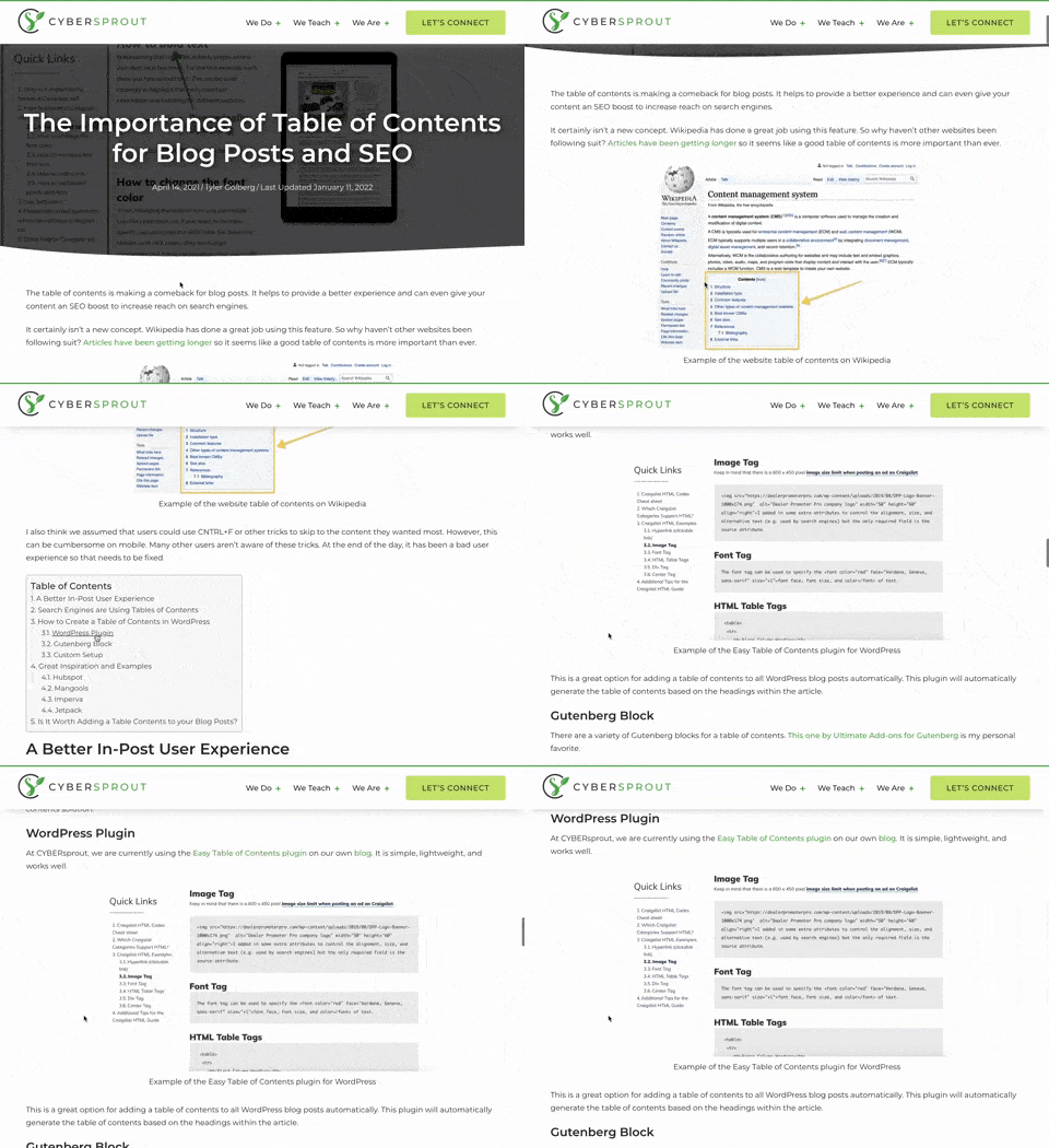
In Cyber Sprout’s article on why TOCs are important for your blog posts, they include a TOC of their own for readers to use as a navigational tool (it’s only natural). The hyperlinks work as anchors to take readers to specific subheadings of the article.
Tiny Links for Big Results
Anchor links are a win-win for you and your audience. They can make your visitors’ lives easier by giving them visual cues to quickly find the exact spot they want to go to on your page. And they’re an excellent way to point your visitors in the right direction.
That said, avoid tacky, overused text for anchor links, such as “click here.” Most of us prefer to have more context before clicking on something. It’s best to stick with a more compelling CTA copy.
Anchor links are only one of the small ways you can improve a visitor’s experience on your landing page. Start monitoring the performance of your landing pages to find out what other tricks make your page convert.

Source link


