Even for those who are experienced in design and imagery, vibrance vs saturation can be confusing.
Saturation is a bit more straightforward. It refers to the intensity of all colors within an image or graphic. If you were to alter the saturation in a graphic, it would make all of the colors in an image more or less intense.
On the other hand, vibrance refers to a type of saturation in Photoshop or other photo editing software like Adobe Lightroom or the image editing tools built into smartphones. When vibrance is intensified, the colors that are duller are saturated at a higher intensity than colors in the image that are naturally more saturated to begin with.
Given their similarities, it might be difficult to know which one to use when editing images. Let’s take a closer look at each and unpack which should be used in different use cases.
What is saturation?
As we mentioned above, saturation refers to the intensities of all of the colors in an image. When you’re using the saturation slider in photo editing software like Photoshop, you’re making adjustments that touch every pixel of the image.
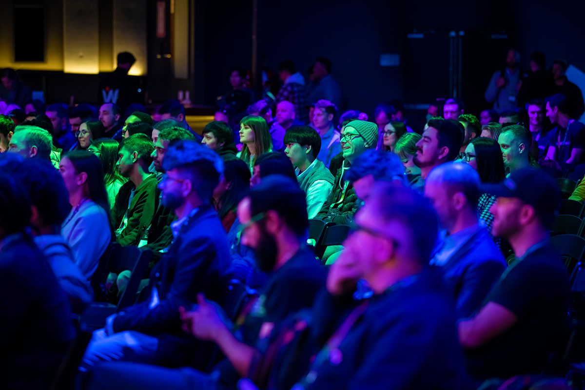
For example, let’s take this photo of some members of our community at Webflow Conf.

As saturation increases, all of the colors become more intense, as shown below.

On the other hand, if we were to turn down the saturation of this photo, all the colors would appear dull.

Because it makes global adjustments to the intensities of every color, even small changes in saturation can dramatically change an image. It’s important to be mindful of how you want the picture to appear — and make your adjustments based on the image look you’re going for.
Oversaturation makes images appear unnatural and fake, whereas undersaturated colors can make photos appear dull and lifeless. The finer details of the original image can also be lost when saturation gets pushed to extremes.
What is vibrance?
Vibrance takes it a step further. It’s a type of saturation adjustment that lets you laser focus on the muted colors in a picture.
Take for example, this crowd shot from Webflow Conf 2022 in which green stands out as the most vibrant color. In the context of the photo, blue and purple are the more muted colors.

With vibrance, you’ll be able to adjust the saturation of the more muted tones like in the blues and purples in the photo.
When we bump up the vibrance in the photo, you’ll see that the green remains the same, whereas the blues and purples become more saturated, as shown below.

Likewise, if we decrease the vibrance in the photo, the green remains the same and the blues and purples become more muted, as shown below.

Saturation vs vibrance: which one should you use?
Determining whether you should adjust saturation or vibrance can be tricky. Both saturation and vibrance can be used to alter the intensities of colors in a photo or image with vibrance being more specific, and saturation affecting all pixels in a picture.
According to Adobe, the best way to use saturation is when you want to make an entire image less dull and want all of the colors to “pop.”
On the other hand, vibrance has a gentler touch. It works especially well for editing photos that have people in them, making it possible to make color adjustments to skin tones, without changing the rest of the colors in an image.
Bring more to your work by diving deeper into color for design
There are so many nuances to color and ways it can be used to enhance your web designs. If you’d like to learn more, we hope you check out Color theory for designers: a beginner’s guide, How color plays into generational marketing, or 10 color meanings: the psychology of using different colors.
For other design related questions be sure to join our forum and make a post. There’s an entire community of Webflow designers out there ready to help out.
Source link


