Importance of popup design
There are various ideas about the usefulness of popups. Some believe that popups create a bad user experience on your website because of the unwanted messages. However, others believe that popups are one of the best marketing tools to attract visitors’ attention and encourage their behavior on your site. In fact, both are right. Popups are a double-edged sword. They can both increase your conversion rate and kill your website’s customer experience. That’s why it’s important to have a good strategy when using WordPress popup plugins. A good strategy is to have good popup design, use attractive content, and show popups at the right time.
What are the best practices in popup design?
Below is a roundup of the best popup design practices to follow when creating popups for your website. I have provided an example of each practice for better understanding.
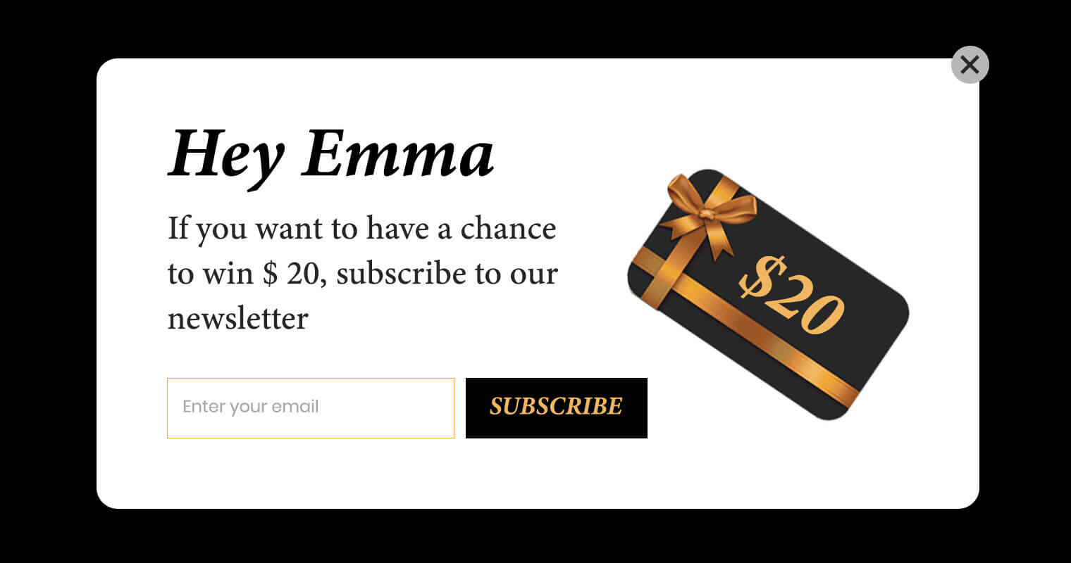
1. Personalize your popups based on user segments
Making user segments and personalization will help your visitors engage better with your content. Without a doubt, if you show a popup with a product that the visitor saw recently and didn’t buy with a good offer, it will perform much better than a popup offering any random product. You can also address the visitor by their name to attract their attention. Geolocational personalizations are also good practices to attract visitors.
2. Clarify your goals
Every popup has a purpose. You may want to get visitors’ email and collect leads, offer a specific product or discount coupon, show specific content that a user might be interested in and more. It’s better to have only a single goal in mind for a popup and determine the copy, design and time to display based on the popup goal.
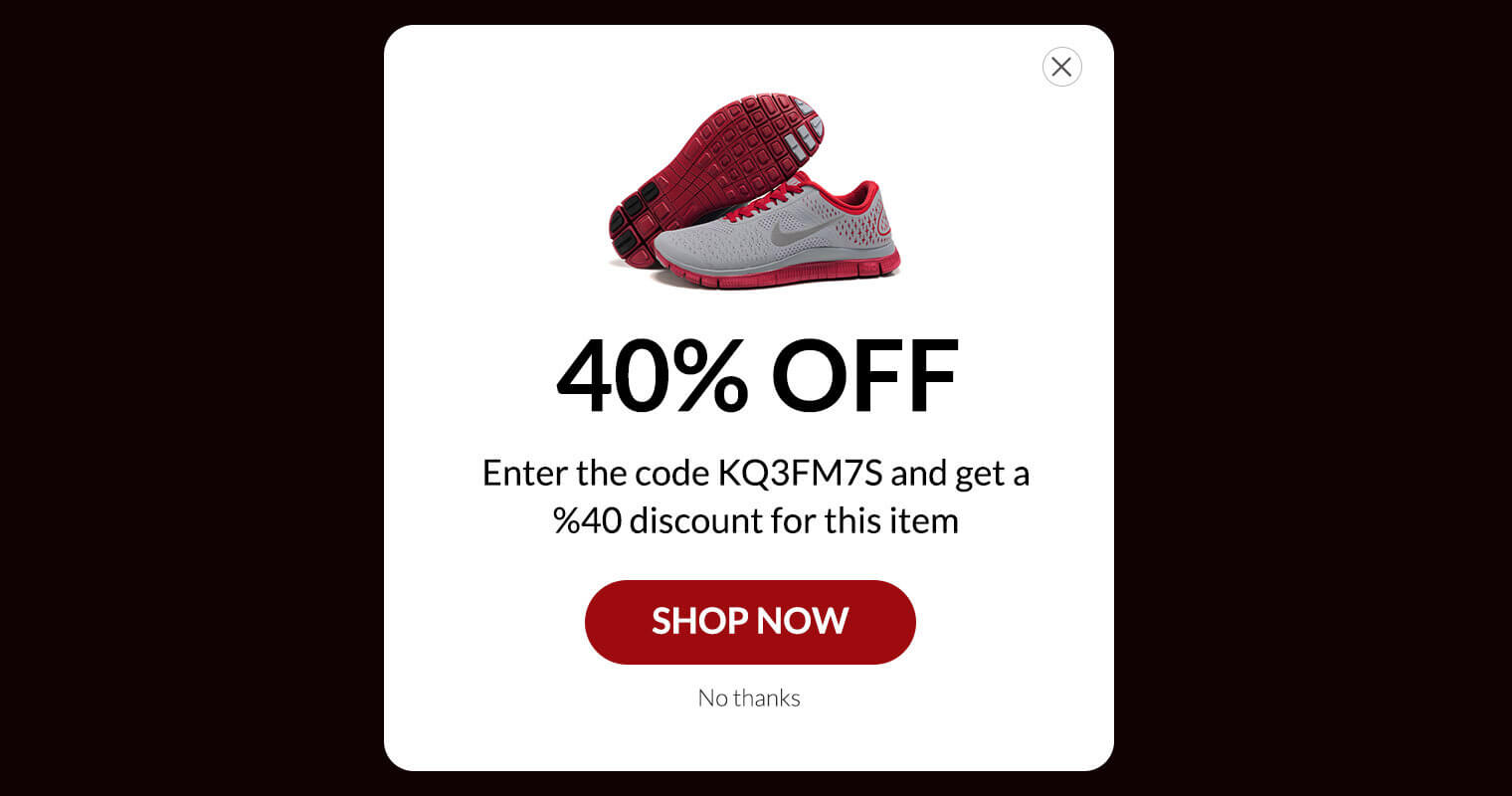
3. Consider the entire website design
The popup should match the design of the rest of the website. You shouldn’t make the visitor feel like the popup is something obtrusive. So, you should match the style, colors, typography with the rest of the website.
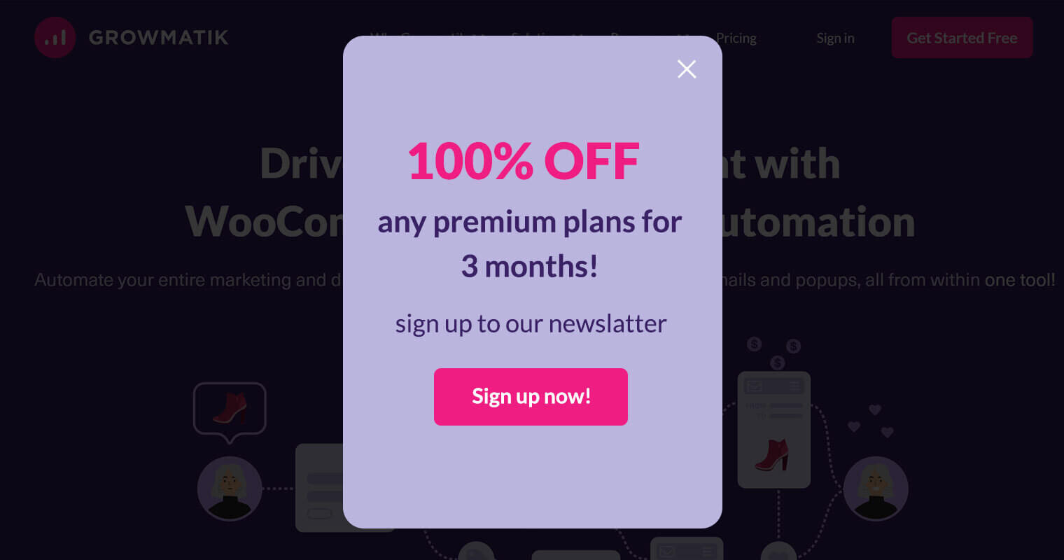
4. Use a targeted and appealing CTA
As mentioned above, the popup should have a clear goal about what action you hope the user will take after interacting with the popup. For most popups you should have only a single CTA button with appealing text and design to attract the visitor to the action you want. Try to be creative in order to make tempting CTAs.

5. Try various kind of popups
I encourage you to use different types of popups to test which ones actually work in your case. Each type has its own advantages and disadvantages.
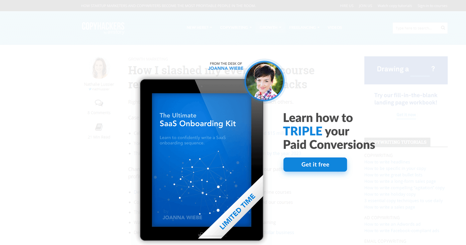
The popup
This kind of popup appears in the middle of the page on top of the page content and usually prevents you from doing anything until you close the popup. While this kind of popup is very popular and eye-catching, it may create a bad experience for the user and cause them to leave the website.
The slide-in
This popup slides in usually from the bottom of the screen and since it doesn’t block the content, it’s more user friendly. However, there is a greater possibility for the users to miss the popup content.
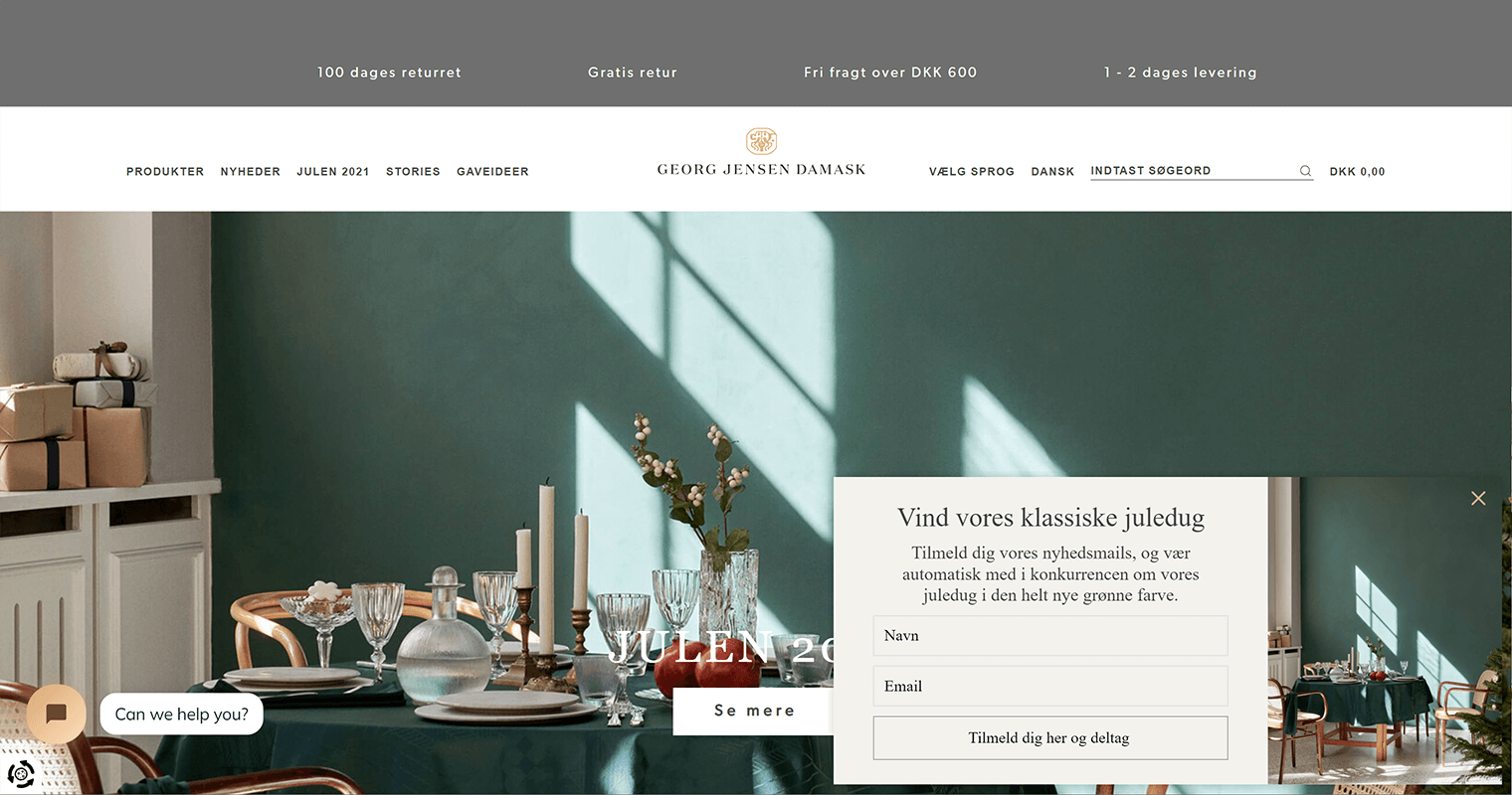
The bar
Also called an announcement bar, this popup sits on the bottom or top of the page and is commonly used when you want to display special offers and messages. For example, you might have a popup that reminds visitors about Black Friday deals or delivers important news when an update is released for your product. Bar Popup’s user experience has been shown as more positive than other forms because they require less space on the screen while still being noticeable without overwhelming users who are browsing through websites with intense color schemes like those found in some advertisements.
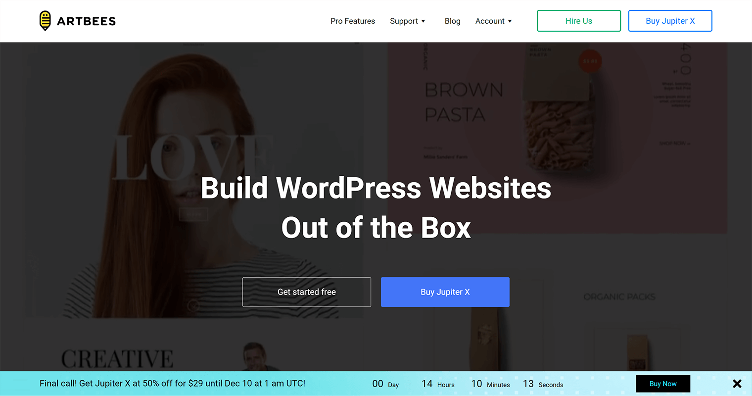
6. Use images to attract visitors
When designing a popup, nothing may be able to attract the user’s attention more than high-quality and relevant photos. Users usually do not have the means to read the text and watch the video. However, an impressive image in a fraction of a second can catch their eye. Therefore, keep all graphics and image quality as high as possible in popup design.

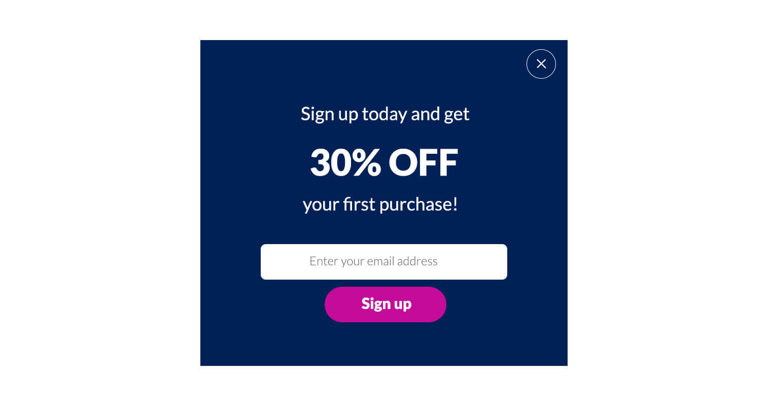
7. Generate leads with tempting offers
Generating leads is one of the most common reasons for popup use. If you don’t give a good offer, you won’t get many submissions. So try to offer something tempting in return for the submission of a user’s email address.
8. Use timed popups to increase conversions
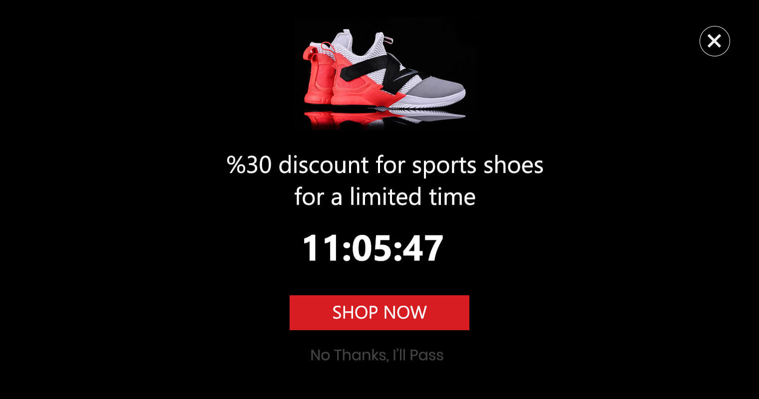
The FOMO (fear of missing out) method is a great practice in order to increase the chance of converting visitors. When you offer something for an unlimited time, the visitor won’t act. So try to have limited time offers in your popup to make visitors hurry and take action.
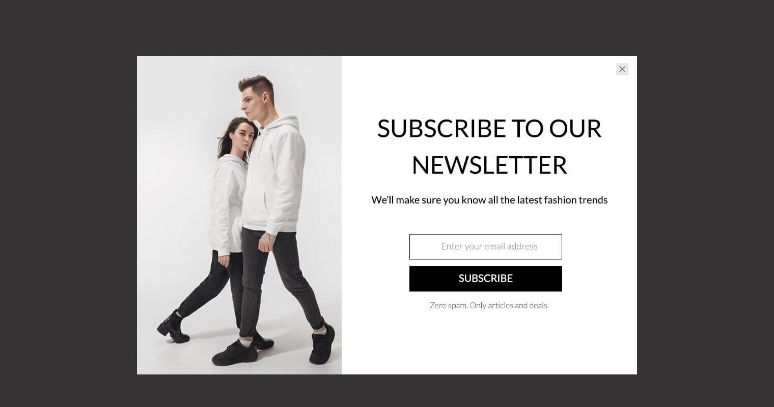
9. Eliminate visitors’ CTA fear
In this part of the popup design, you have to convince the application users that you will not disturb them. Users are afraid of too many promotional emails and may not cooperate with you.
However, if you reassure them that you are sending only a certain number of emails a month, it will ease their concerns. It is best to place this note directly under the CTA button.
10. Consider mobile users
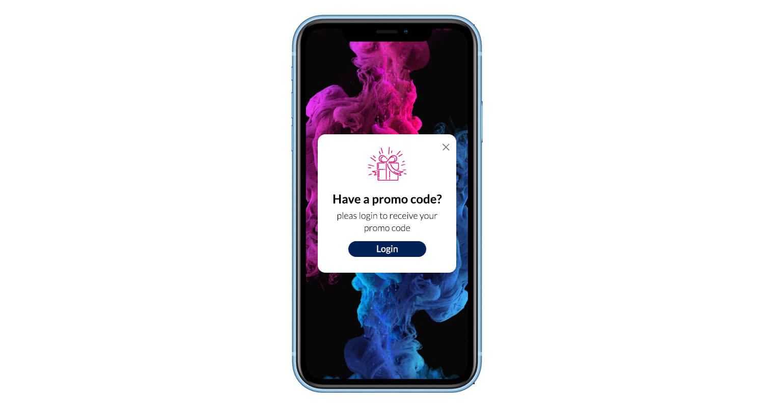
Do not ignore the fact that your popup is not displayed only for computer users. These days there are more mobile users than desktop users. The incompatibility of your design with the smartphone environment will cause you to lose a large potential audience and also result in a bad user experience. You can check mobile compatibility while you design the popup.
11. Use exit popup to keep visitors on your site
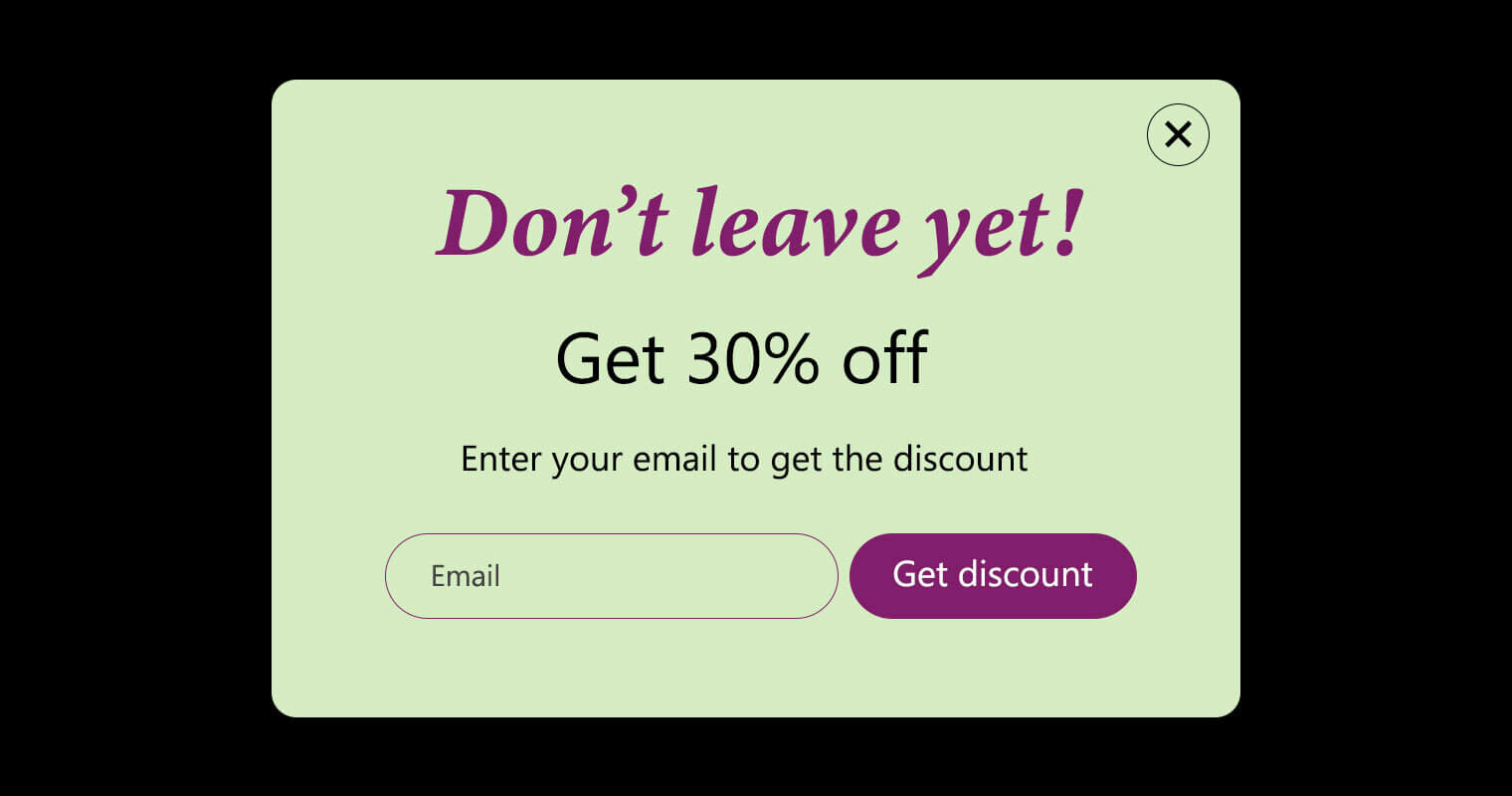
By using the exit popup show action, you will make users spend more time on your website. This will further increase the productivity of your website. Exit intent popup is your last effort to keep the visitor on the website and do the action you want on your website.
12. Use geometric elements to grab attention
The use of geometric shapes grabs users’ visual attention.. Just keep in mind that overuse of figures can make your design crowded and annoying. Be sure to keep a balance.

13. Use colors with good contrast
Color is also one of the first visual impressions that a user gets when visiting a website. Use a harmonious color palette with good contrast to be more effective. Considering these small tips, makes the final result amazing.
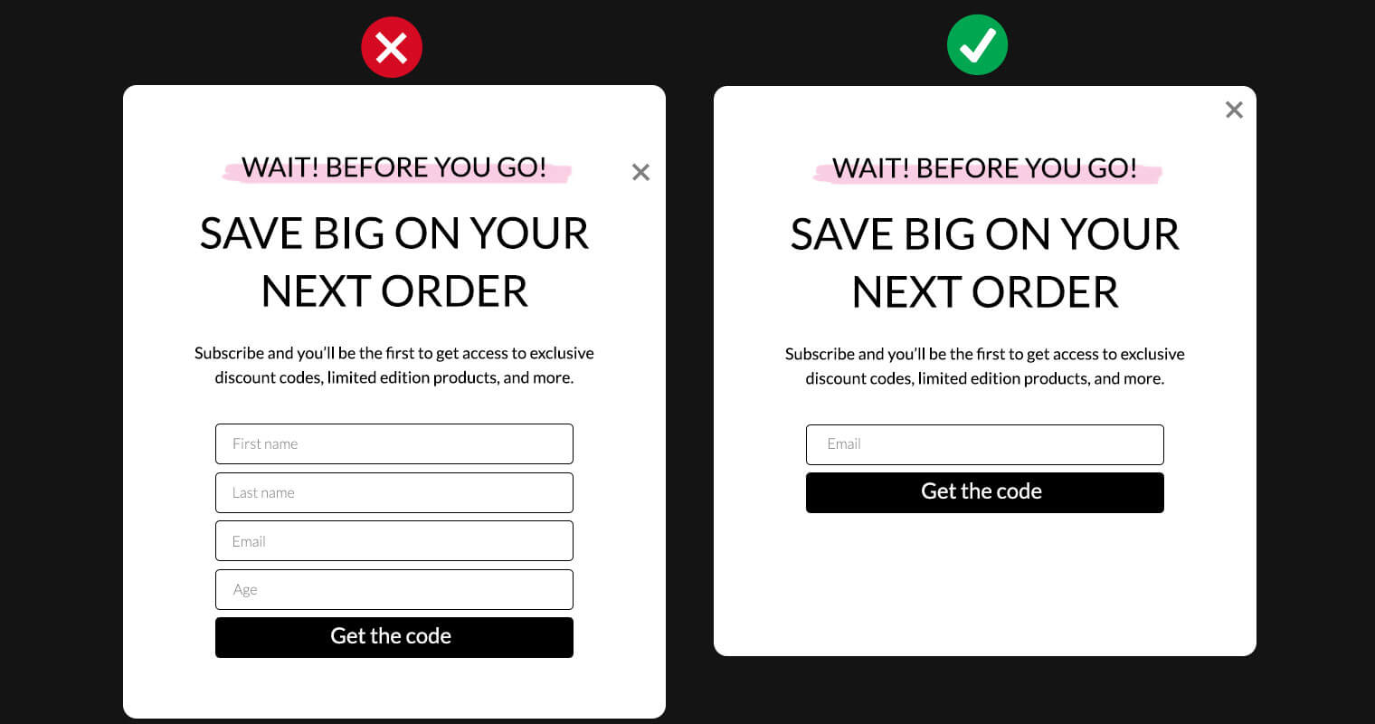
14. Ask for less information to increase conversion rate
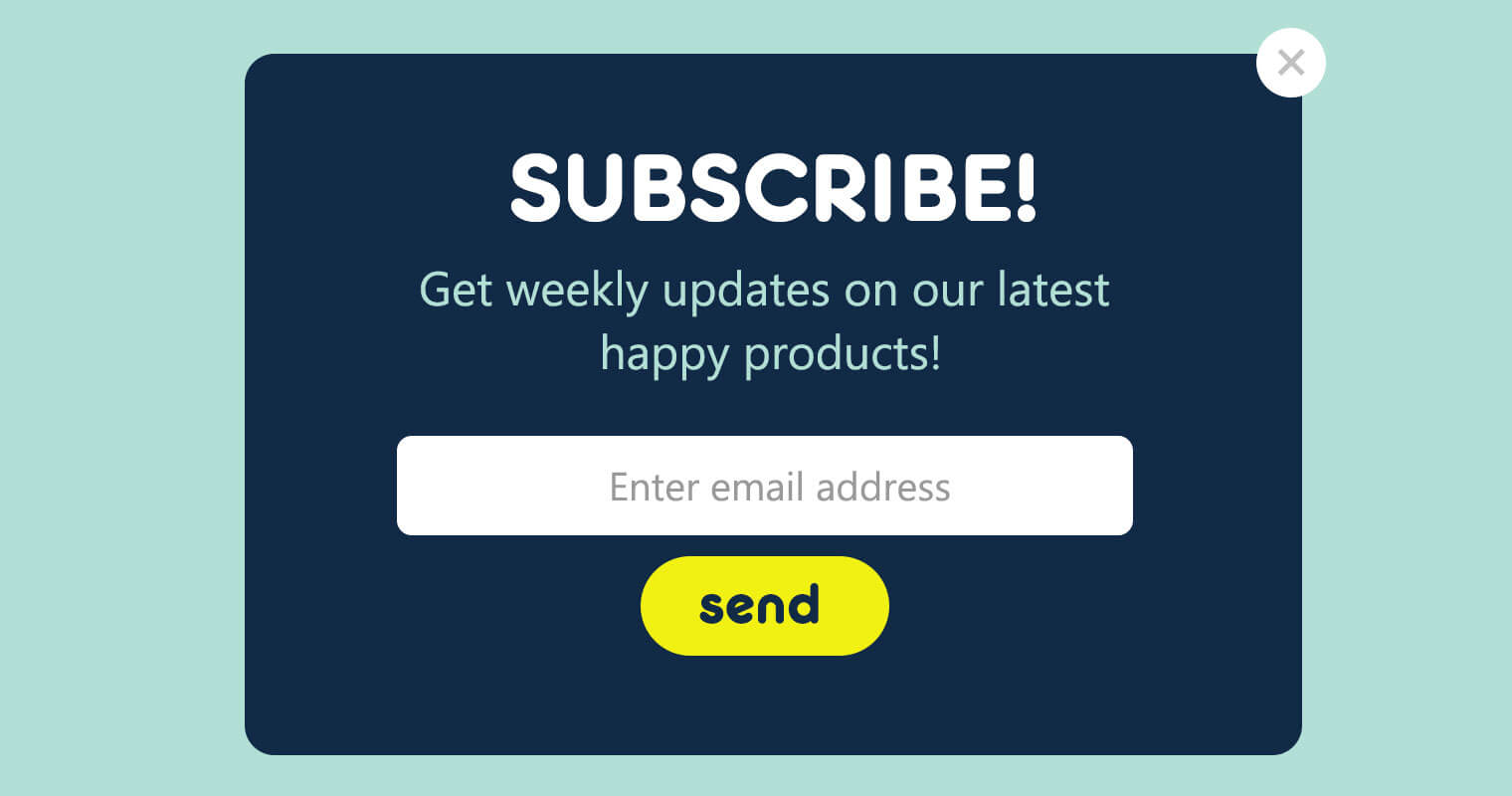
You should only collect necessary information in forms like the subscription form. The more input fields you have, the less visitors are willing to complete them and submit the form.
15. Choose the right font for your popup
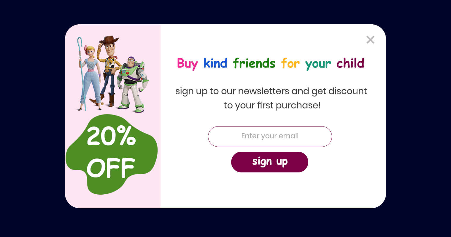
If you’re doubtful about which font to use in your website, it’s better to use the fonts that are used most frequently on your website. Try to use creative fonts in headings to attract visitors and the normal font you used in your website in your copy content.
How Growmatik can help
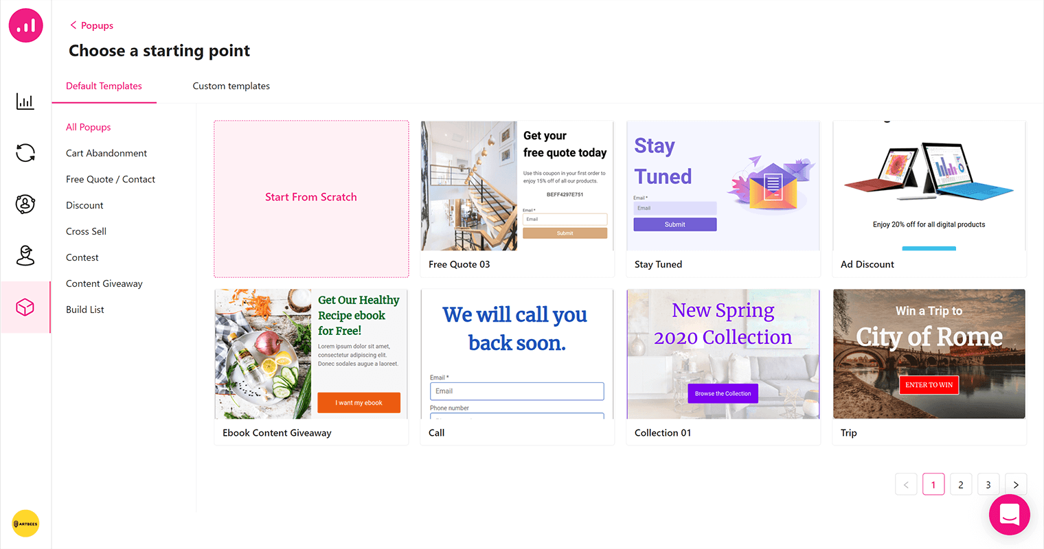
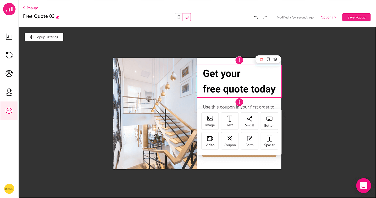
Growmatik is a marketing automation tool that can help you create effective popups in WordPress. Included in Growmatik is a visual popup builder with ready-made templates. To access the popup builder, just navigate to the Workshop within the dashboard, select Popups and then click on the Create Popup button. It opens a window where you’ll find pre-designed popups. You may select to edit or create a new one.
Growmatik popups can be automated according to many different conditions in just a number of clicks. Finally, analysis and data of any popup’s performance is available which allows you to refine and adjust your popups according to what performs best.
Wrapping Up
Use the practices mentioned above and combine them together to form a solid popup design strategy on your website. Don’t forget to make your popups personalized and diversify your popup designs for all segments of users. Creating a popup for different segments of users will help you increase your conversion rate. Put yourself in visitors’ shoes and be sure that this popup is the thing that you would like to see on this website.


