With the new year comes a host of new websites. Some of these sites have been brewing for months, and others were developed over the holidays, but they’re all having a big impact this month.
Here’s our roundup of the twenty best new websites released in the past four weeks. Enjoy!
MCO
Millor Creative Office uses scroll detection to pull in a burst of color thanks to a video of ink in water. Keep scrolling, and you’ll find the site is filled with some luscious gradients.
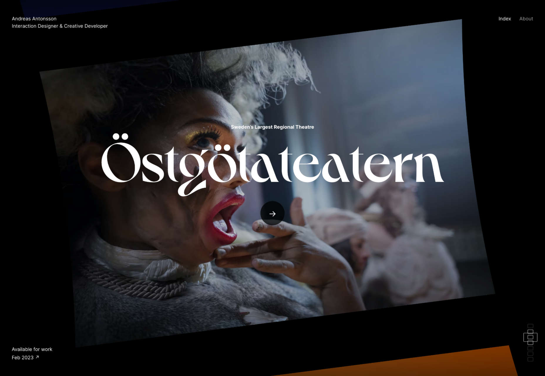
Andreas Antonsson
Andreas Antonsson’s portfolio is a rotating drum of case studies that spins as you scroll. It’s a great reinvention of a well-worn design pattern.
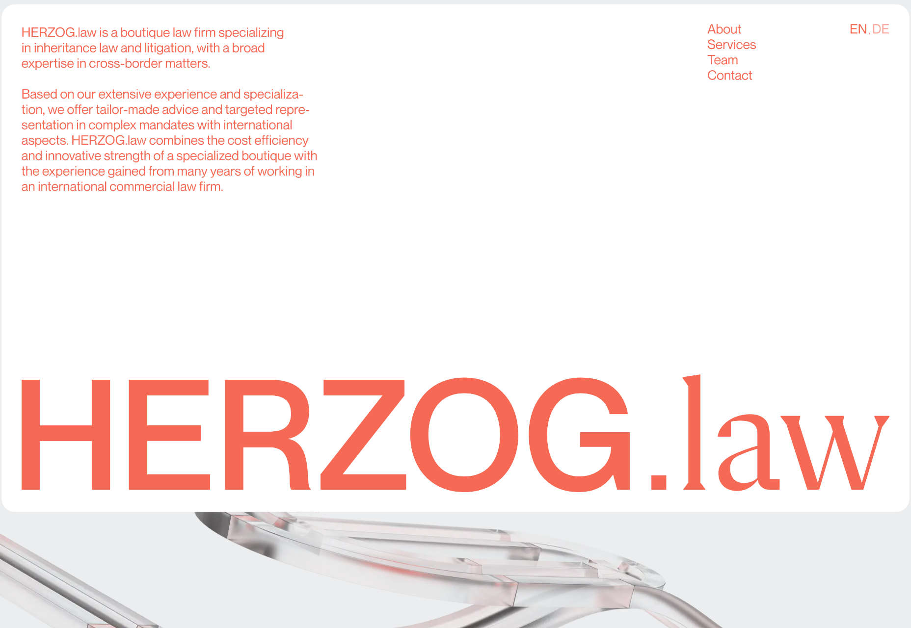
Herzog.law
The site for Herzog.law is more like a startup than a law practice. The marble-run style illustrations add visual interest to the persuasive copy.
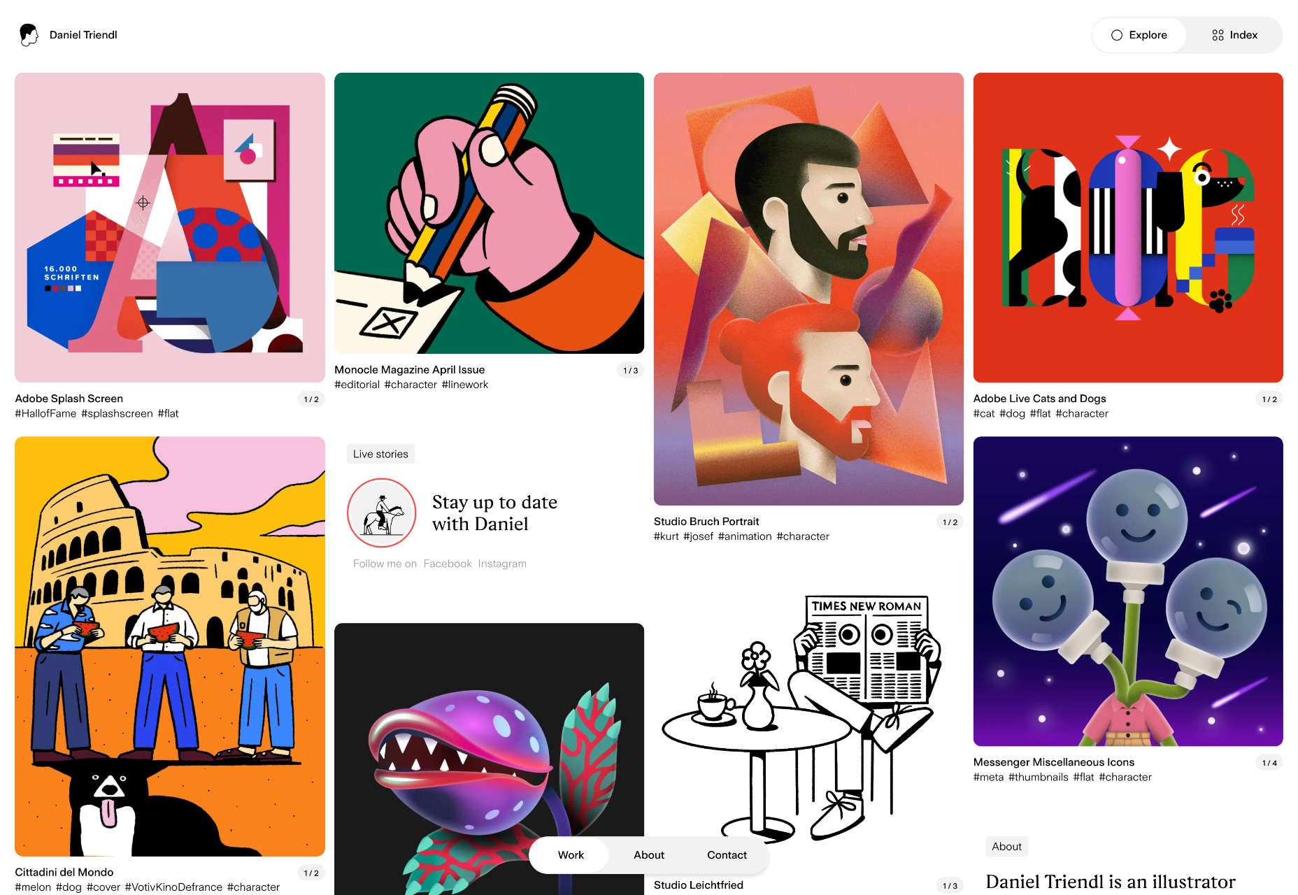
Daniel Triendl
Daniel Triendl’s awesome portfolio looks more like a Pinterest board than a personal site. You’ll find yourself browsing before you realize it.
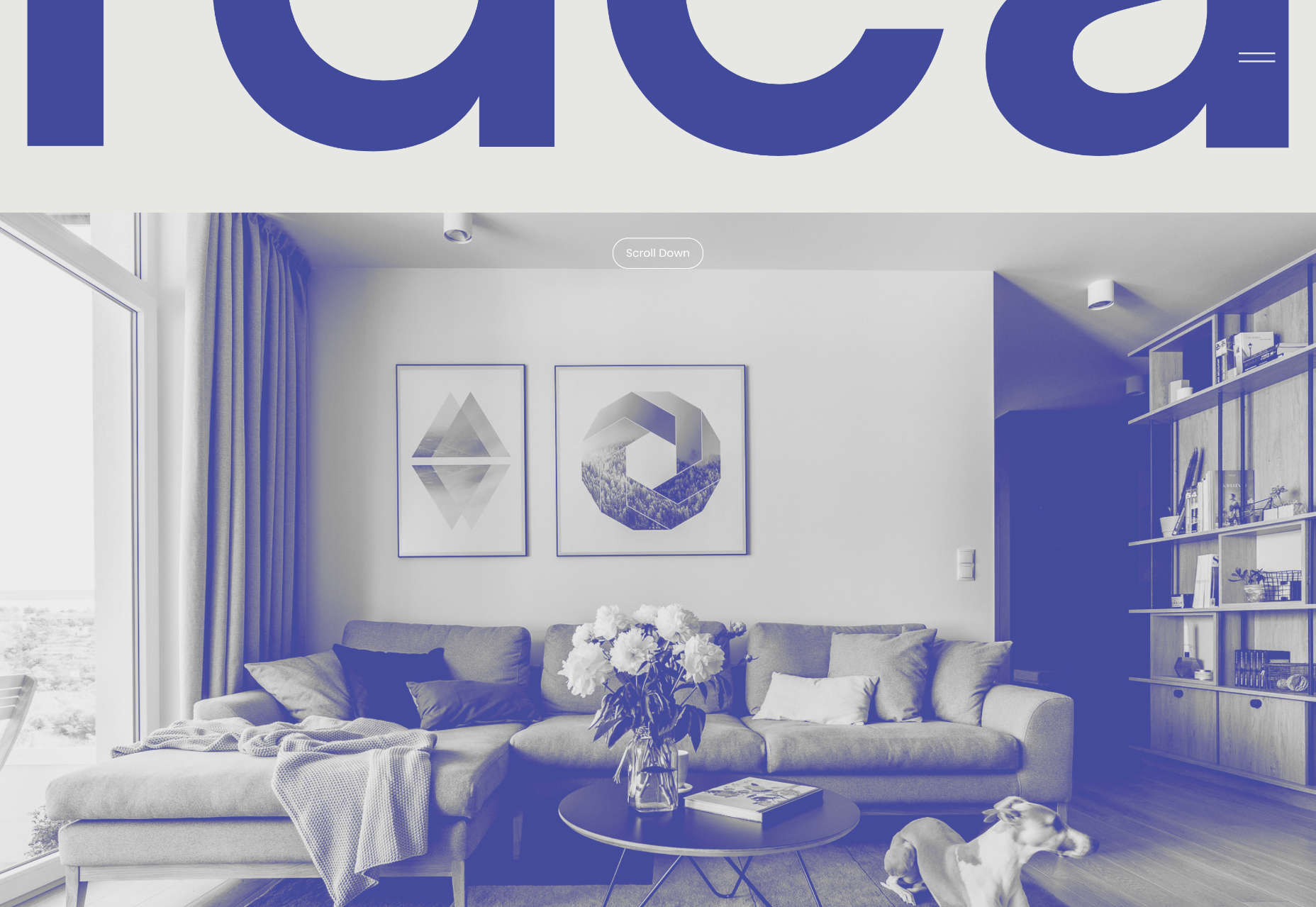
Raca
Raca Design Studio specializes in architecture, interiors, and product design. Its site uses monotone filters to create a stylish look.
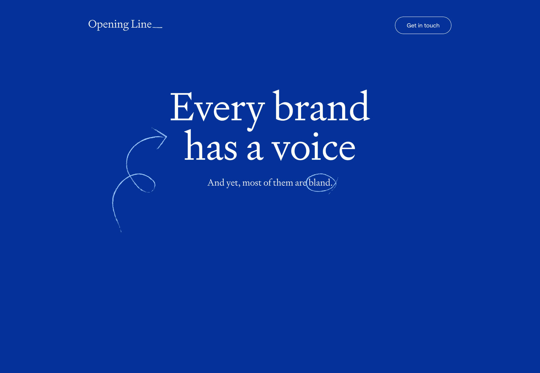
Opening Line
Opening Line is a great one-pager for a copywriting agency. The simple illustrations and the animated stroke are delightful.
Women Rise
Now that the crypto winter seems to be easing towards spring, there’s renewed interest in NFTs. Women Rise is one of the best NFT projects we’ve seen.
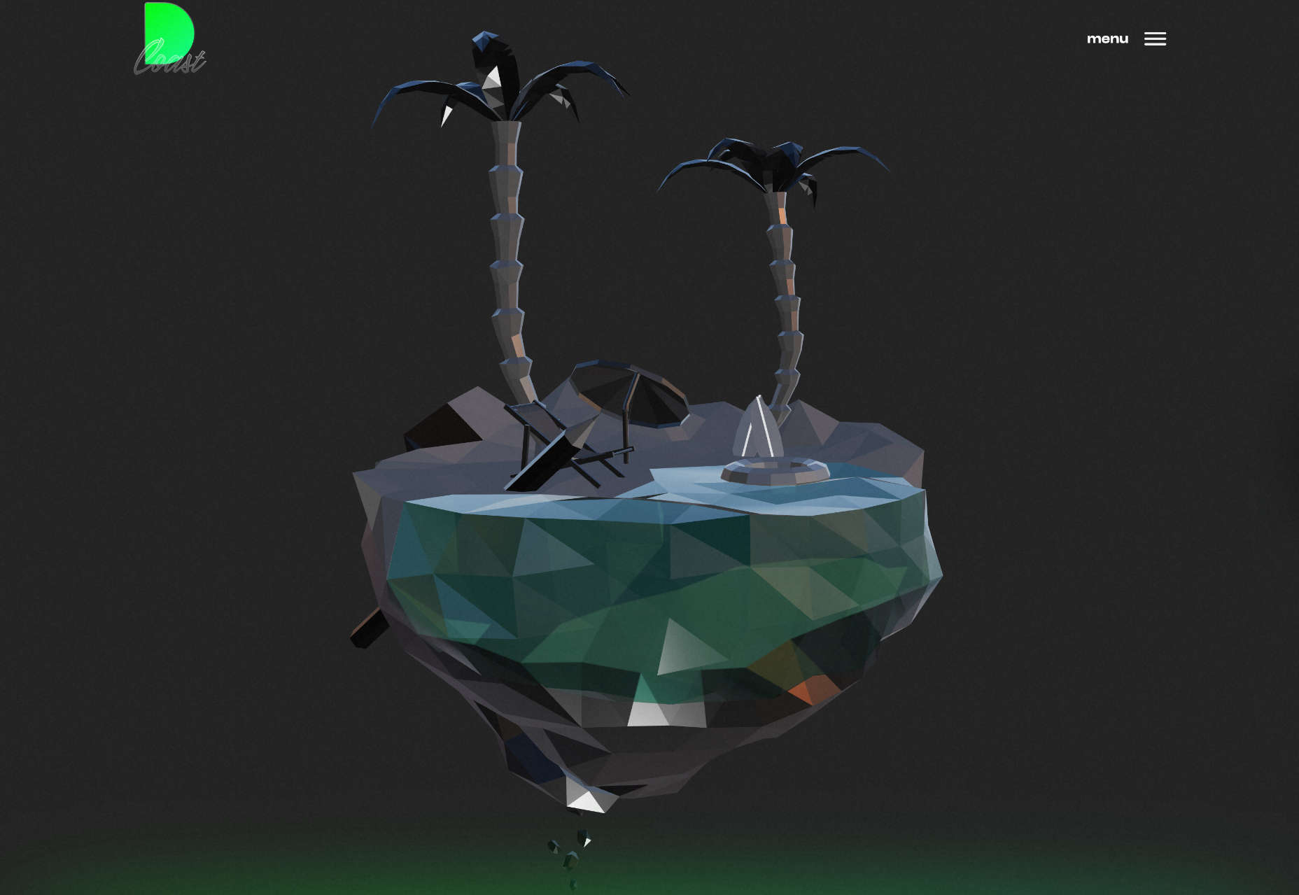
DCoast
DCoast jumps aboard the 3D-graphics trend with a tiny tropical island. It’s an eye-catching way to disguise a small portfolio while the jobs build up — which they surely will.
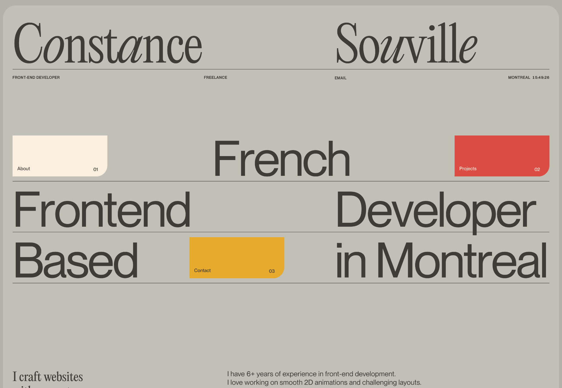
Constance Souville
Constance Souville is a freelance front-end developer. Her portfolio is simple and smooth, with some lovely detailing.
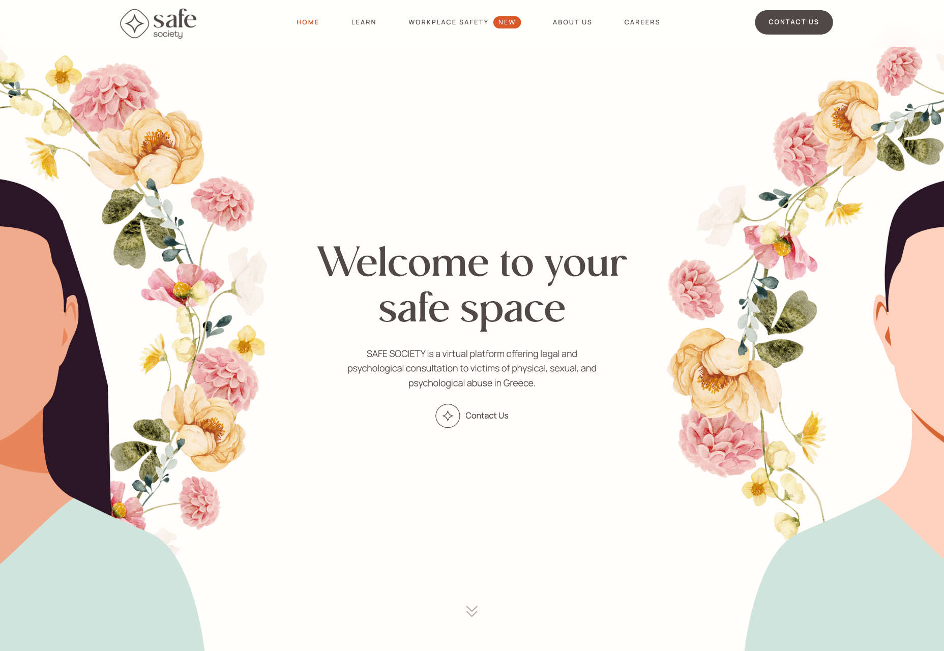
Safe Society
Safe Society is a platform to support victims of all forms of abuse in Greece. It uses delicate illustrations to talk about difficult issues sensitively.
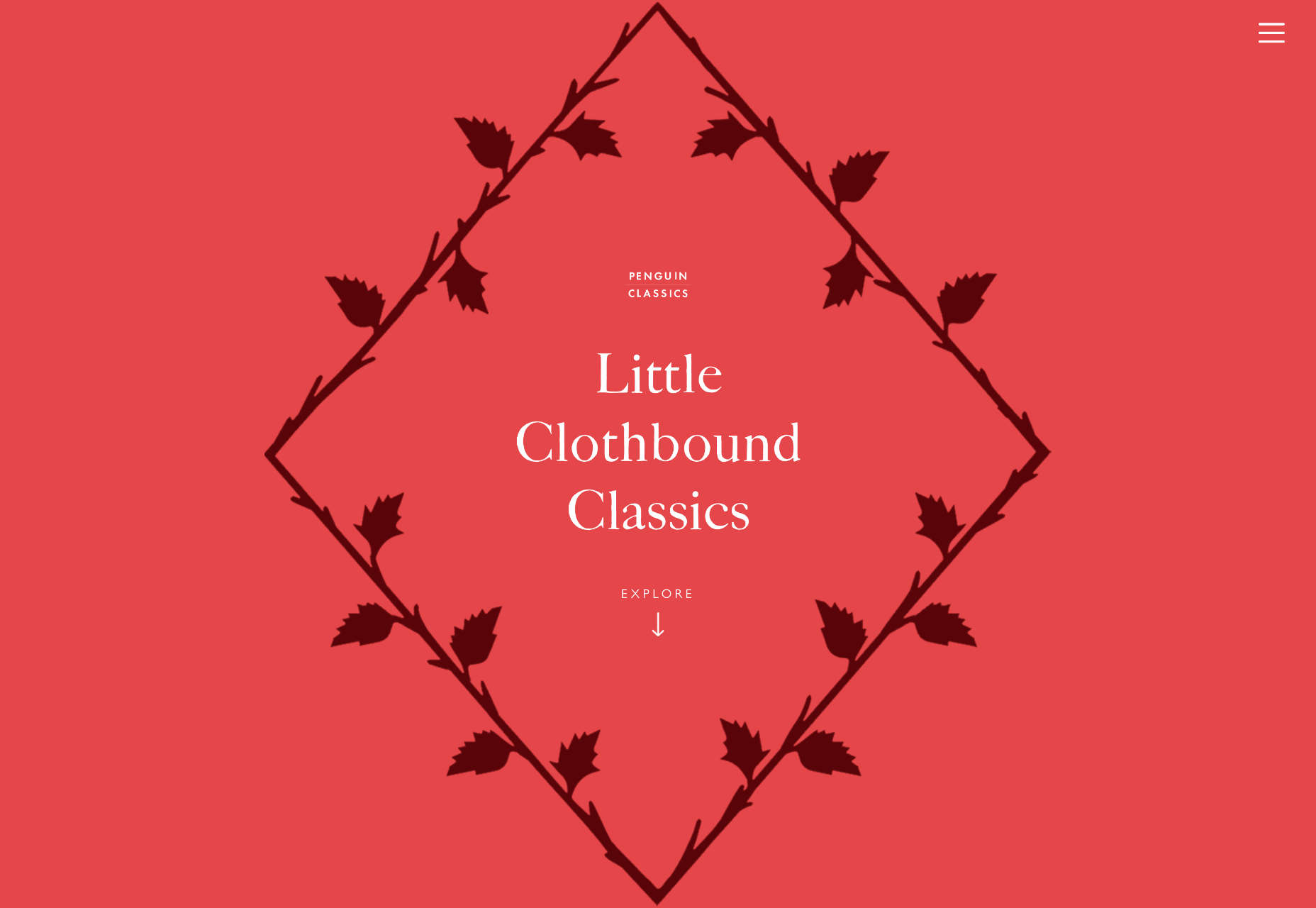
Little Clothbound Classics
Penguin Classics publishes some of the greatest works in English literature, and this lovely one-pager introduces us to some lesser-known classics.
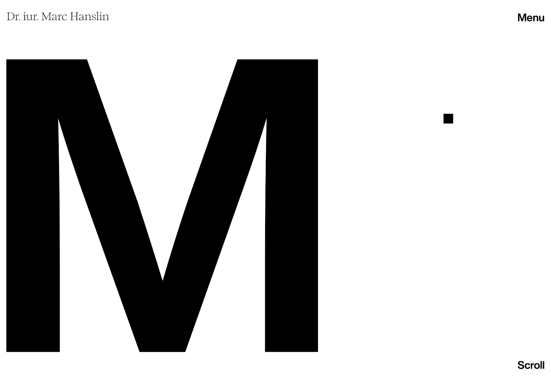
Marc Hanslin
The personal site for Marc Hanslin is a fantastic one-pager with stark black-and-white contrast. It’s far slicker and more engaging than a typical lawyer’s site.
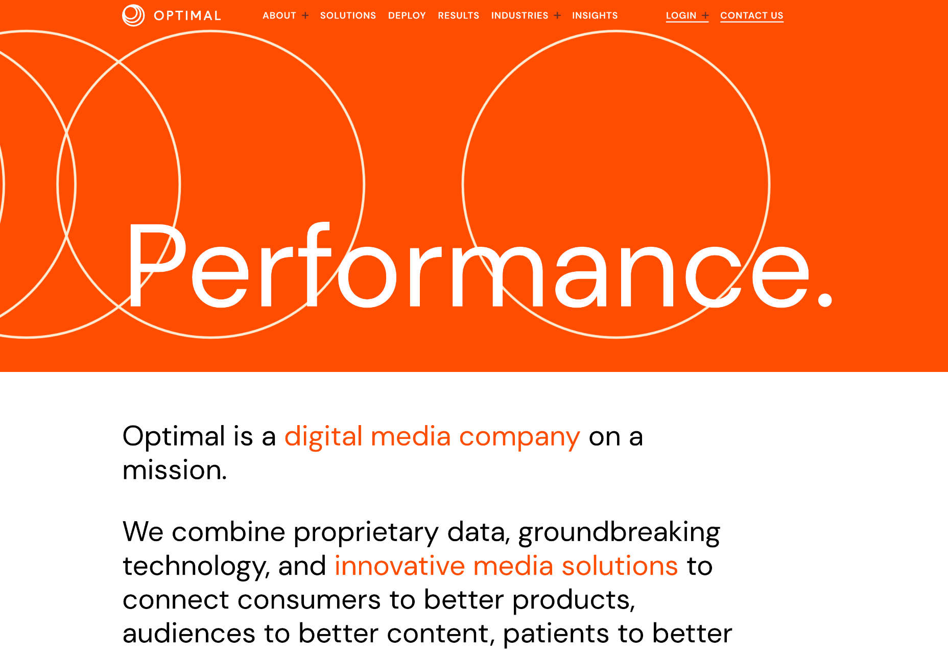
Optimal
Optimal is a digital media company with a simple approach to business problems online. It’s an interesting text-based approach.
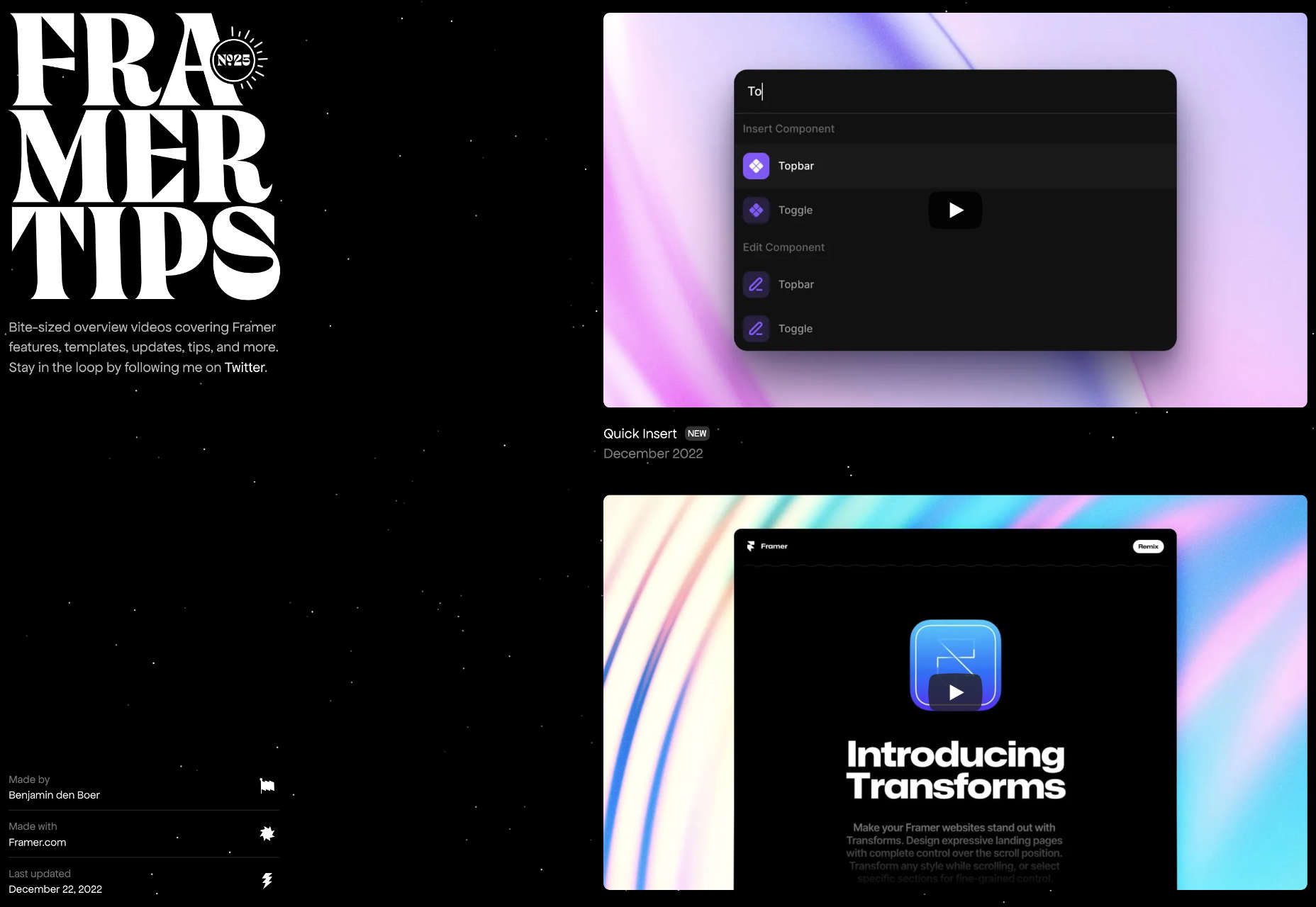
Framer Tips
Framer Tips is a collection of tips for Framer, created, surprisingly enough, in Framer. It’s a level above the normal tips-n-tricks sites.
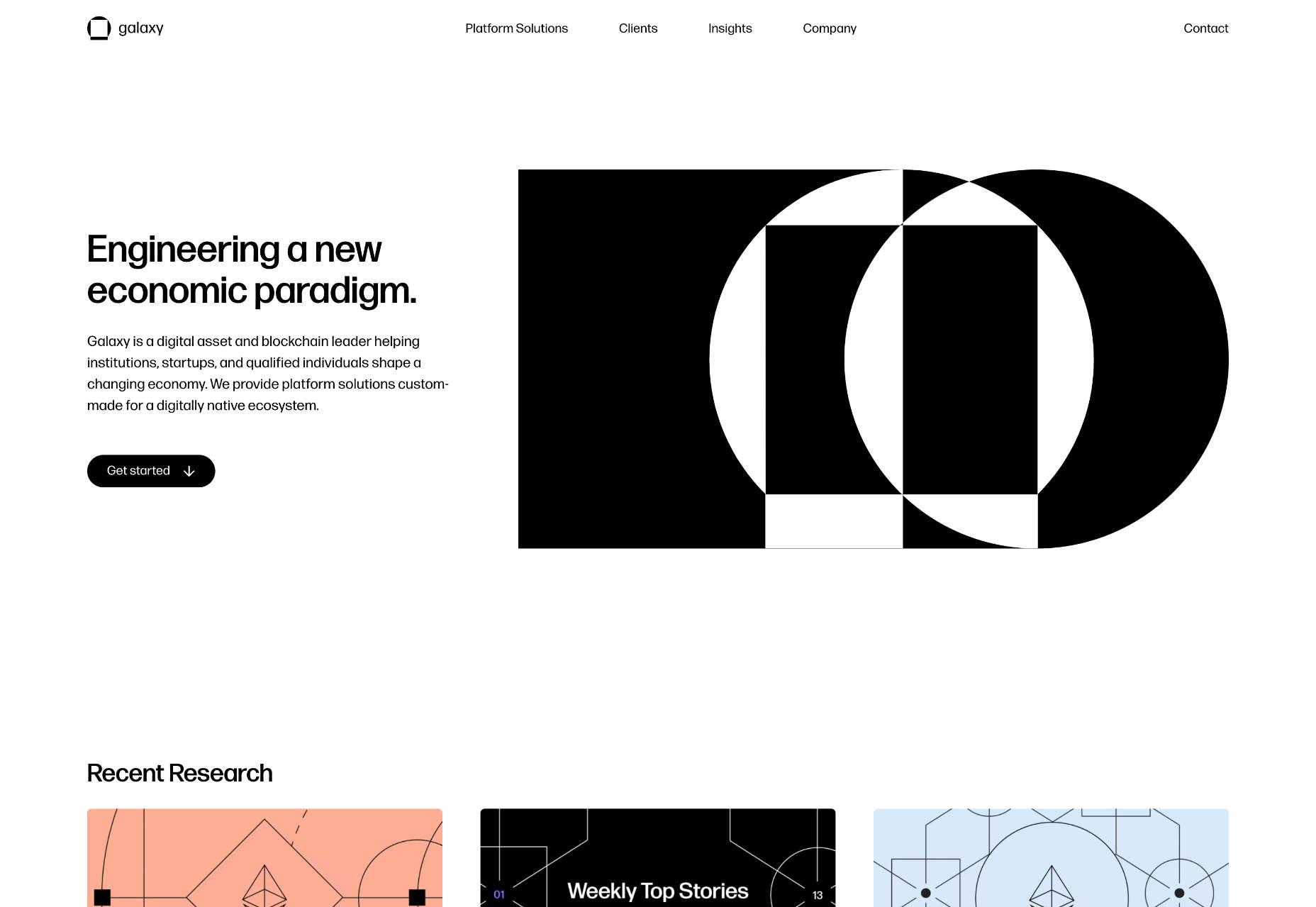
Galaxy
It’s not easy creating sites for blockchain companies because the technology is so new and changing rapidly. Galaxy does a great job with bold black and white.
Italamp
Italamp is a slick site filled with stunning lighting products. The design uses carefully positioned gradients to emphasize the lighting qualities of its products.
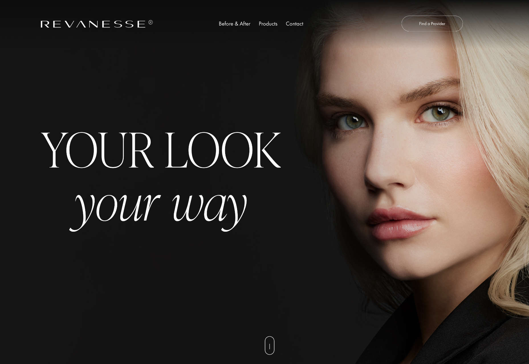
Revanesse
Cosmetic surgery isn’t the easiest sell, no matter how minor, but the site for Revanesse does a great job by focusing on confidence, not aesthetics.
Dot Films
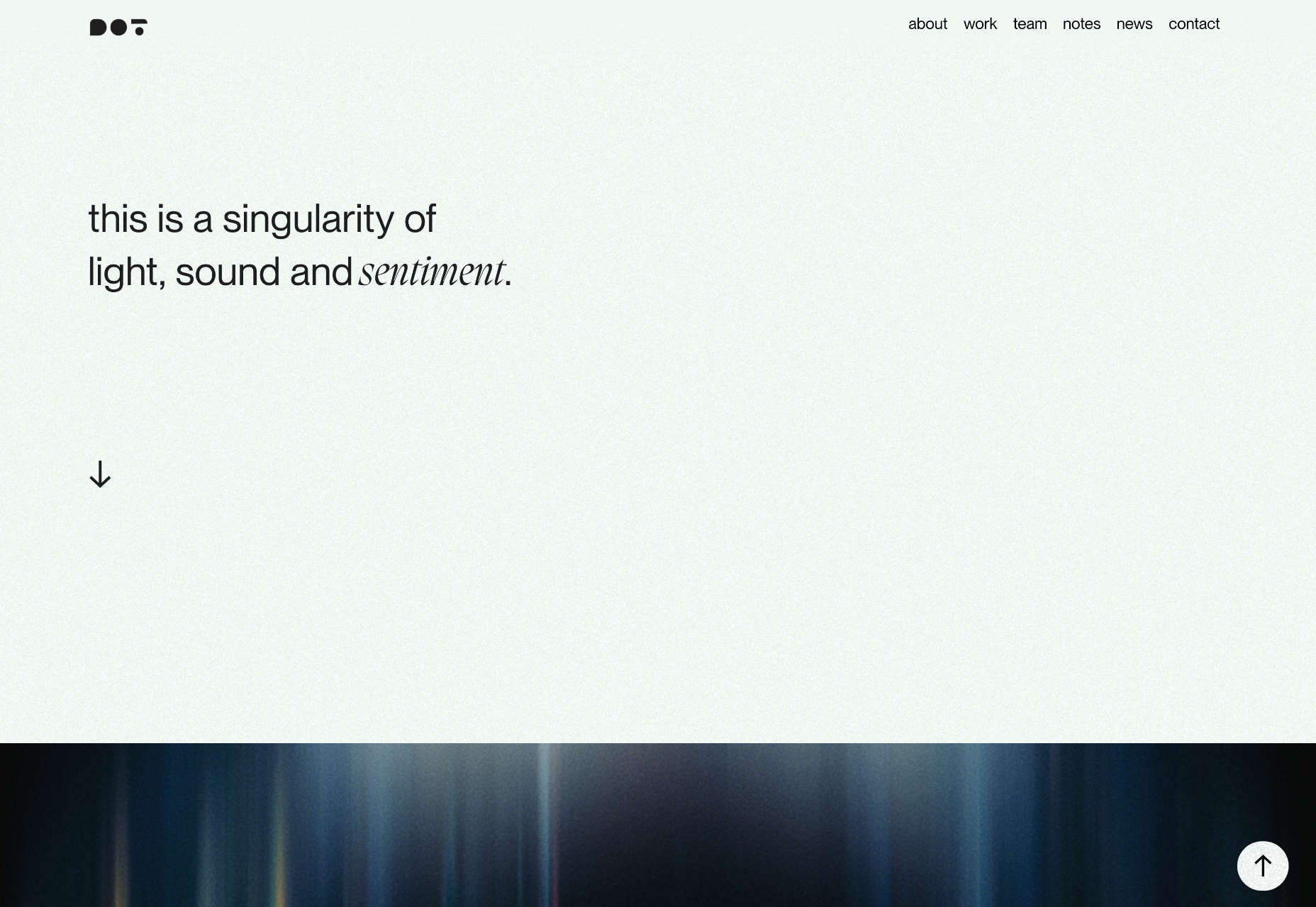
There’s tons to like about this site for Dot Films, from the neat little animated logo to the bold typography. It’s confident without over-selling it.
chrls.design
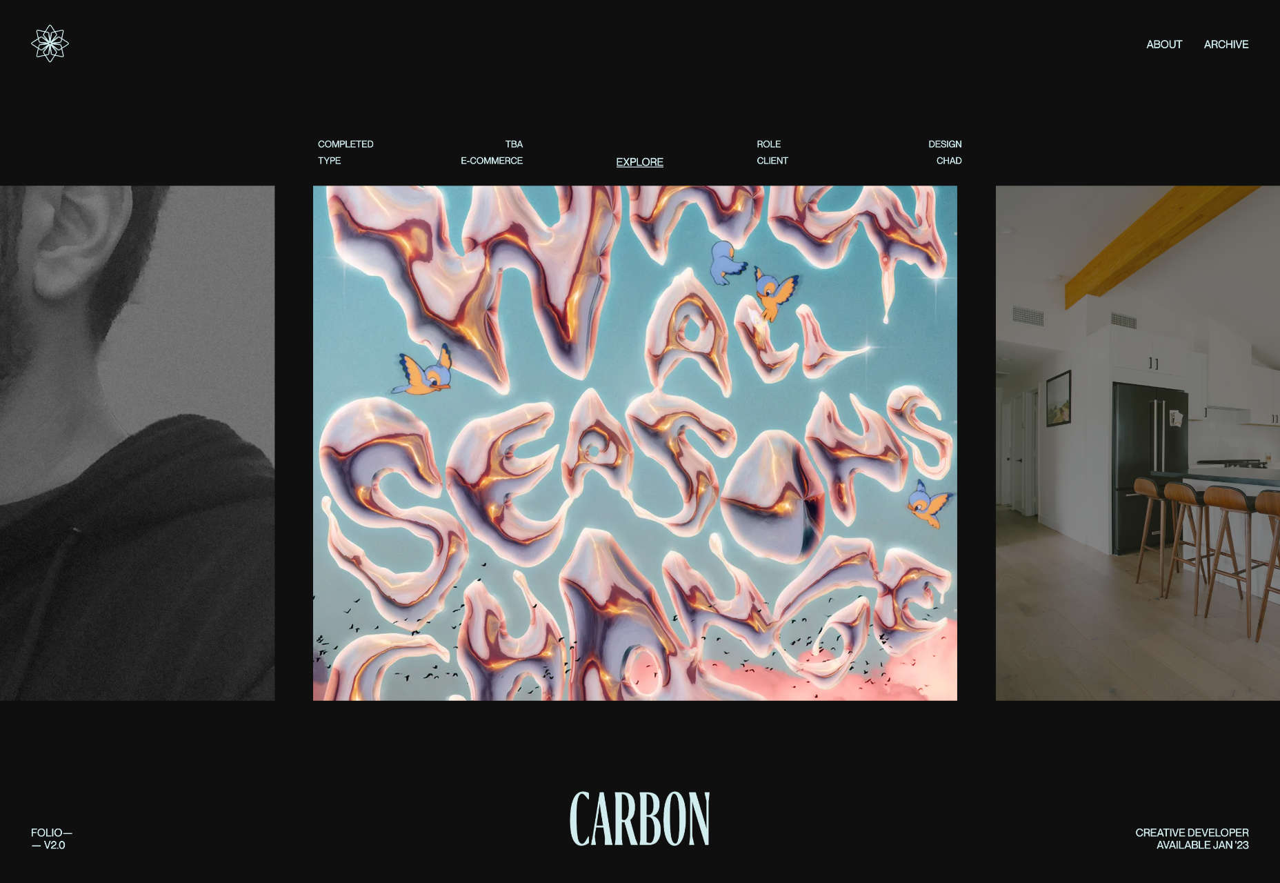
Charles is a designer and developer with an impressive portfolio. His site is beautifully realized with a simple slideshow that encourages you to dip in and out.
Ariga
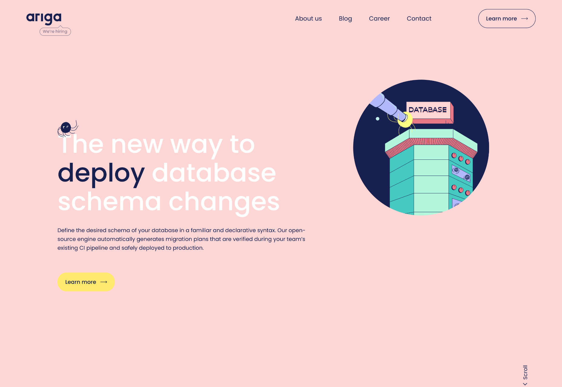
Ariga offers a new way to manage database schema changes. And while that may be a dry topic, the awesome reactive illustrations on its site are anything but.
Source link
